

Google
Google
Google
Google
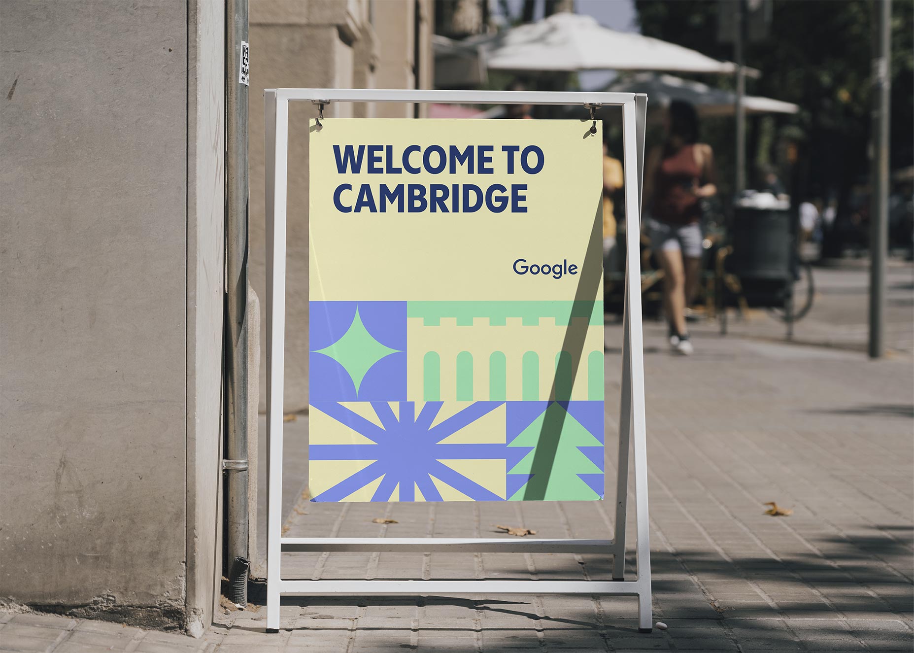
“Greetings From” is a merch collection for the Google Merchandise Store celebrating 100+ Google campus locations worldwide.

(01)
Project Overview
Transform Google Merchandise Store from logos on swag to creative products that inspire.
The Google Merchandise Store sells a lot of stuff. Millions of dollars of swag are sold in-store and online globally each year, and a vast majority of those products just said “Google.” Googlers were begging for more “Googley” merchandise to express the fun, creative, and playful sophistication that is at the heart of Google. Google hired Motto® to create and design the “Greetings From” collection to celebrate their 100+ global campus locations, from L.A. to London, Sydney to Singapore.
Details
- Engagement Flagship®
- Type Brand Expansion
- Services Art Direction, Product Development, Design System
- Category Tech
(02)
Challenge
Increase Google brand love by putting creative merch with soul back in the store.
Googlers proudly wear Google logo shirts, backpacks, and water bottles, but they also want quirkier things that speak to why they don’t work at a company where they need to wear chinos and dress shoes. Google wanted to bring back the authenticity with the winks, the nods, the inside jokes, and the playful sophistication that is “Googley.” Our mission at Motto® was to help put merchandise with soul back in store.
(03)
The Motto Method®
Design a merch collection for Google fans, employees, and yes, even moms of Googlers.
Sure, Google has a lot of engineers. But they also have incredible designers, sales teams, and marketing gurus, those doing educational work and food experts who want to proudly represent the diverse culture of Google. Googlers are varied by age, interest, gender, location, ethnicity; you name it. By capturing the Google ethos, Motto®’s work created something for everyone to love.
Words from the client
Let's work together“Motto® is an incredible partner in every way. I can’t say enough good things about their ability to understand our needs and bring our ideas to life with even more beauty and zest than we could have imagined. ”
(04)
Motto Method®
/ Immersion
/ Immersion
From culture to design, Motto® looks at every brand holistically.
Familiarizing ourselves with Google, Google’s initiatives, teams and culture was an essential part of the process. The better we understood what Google was working on and working towards as a whole, the better we were able to conceptualize ideas, design stuff Googlers would connect to and love, and create products that would succeed in retail.
What we did
- Strategic Brief
- Vision Boards™
- Creative Direction
(05)
Motto Method®
/ Strategy
/ Strategy
Create a strategic-led brand system built for flexibility and adaptation.
We created an intelligent and functional visual system reflecting Google’s playful spirit. A vast color system and scalable typography solution unified the 100+ campus locations, so Google’s design team process can quickly scale the systems across Google products. The design system can be implemented across mugs, tumblers, stickers, apparel, murals, and other merchandise and physical and digital experiences. Motto® crafted a strategy that allowed flexibility within a set structure to provide a diverse system. This system utilized typography, color, grids, and graphic shapes to achieve both goals.
What we did
- Art Direction
- Typography
- Color Systems
- Grid and Layouts
- Patterns and Shapes
(06)
Design System
/ Typography
/ Typography
Playful typography evokes fun and nostalgia.
Google is known for its powerful technology and ubiquitous presence, and the “Greetings From” project aimed to celebrate the creativity that runs parallel to innovation. Drawing inspiration from vintage postcards, Motto designed layered typography that feels friendly, welcoming, and spirited.
What we did
- Brand System
- Brand Guidelines
(07)
Design System
/ Color
/ Color
Inviting color schemes portray a playful and friendly tone.
Google has a simple, well-recognized primary color palette for its brand. The “Greetings From” series needed a different look and feel to highlight the personal experience of each campus. Motto® curated color combinations with visual contrast and design unity. Within these guidelines, each campus received a unique color palette built around similar design principles, yet provided distinction between each location.
What we did
- Color Applications
- Campus-Specific Palettes
- Color Guidelines
(08)
Design System
/ Grid
/ Grid
Versatile grids for visual elements created an adaptable canvas.
Motto offered flexible design solutions in the form of an adjustable grid system that provided structure for the brand elements. This system also added scalability and made application to future projects easier.
What we did
- Grid System
- Color selection
- Typography
(09)
Design System
/ Shapes
/ Shapes
Symbolic shapes offer a modular design system that can be built on like Legos.
To provide uniform designs with variability for individual campuses, Motto crafted a set of modular shapes inspired by the local weather and landscape that could be used with the contrasting color palettes. Motto designed these symbolic shapes to easily stack for cohesion. When coupled with the grid system, these shape selections become extremely versatile and offer scalable design options for future campuses.
What we did
- Symbolic Shapes Catalog
- Color Implementation
- Stackable Visual Elements
- Grid Compatibility
(01)
Project Overview
Transform Google Merchandise Store from logos on swag to creative products that inspire.
The Google Merchandise Store sells a lot of stuff. Millions of dollars of swag are sold in-store and online globally each year, and a vast majority of those products just said “Google.” Googlers were begging for more “Googley” merchandise to express the fun, creative, and playful sophistication that is at the heart of Google. Google hired Motto® to create and design the “Greetings From” collection to celebrate their 100+ global campus locations, from L.A. to London, Sydney to Singapore.
Details
- Engagement Flagship®
- Type Brand Expansion
- Services Art Direction, Product Development, Design System
- Category Tech

(02)
Challenge
Increase Google brand love by putting creative merch with soul back in the store.
Googlers proudly wear Google logo shirts, backpacks, and water bottles, but they also want quirkier things that speak to why they don’t work at a company where they need to wear chinos and dress shoes. Google wanted to bring back the authenticity with the winks, the nods, the inside jokes, and the playful sophistication that is “Googley.” Our mission at Motto® was to help put merchandise with soul back in store.

(03)
The Motto Method®
Design a merch collection for Google fans, employees, and yes, even moms of Googlers.
Sure, Google has a lot of engineers. But they also have incredible designers, sales teams, and marketing gurus, those doing educational work and food experts who want to proudly represent the diverse culture of Google. Googlers are varied by age, interest, gender, location, ethnicity; you name it. By capturing the Google ethos, Motto®’s work created something for everyone to love.


Words from the client
Let's work together“Motto® is an incredible partner in every way. I can’t say enough good things about their ability to understand our needs and bring our ideas to life with even more beauty and zest than we could have imagined. ”
(04)
Motto Method®
/ Immersion
/ Immersion
From culture to design, Motto® looks at every brand holistically.
Familiarizing ourselves with Google, Google’s initiatives, teams and culture was an essential part of the process. The better we understood what Google was working on and working towards as a whole, the better we were able to conceptualize ideas, design stuff Googlers would connect to and love, and create products that would succeed in retail.
What we did
- Strategic Brief
- Vision Boards™
- Creative Direction


(05)
Motto Method®
/ Strategy
/ Strategy
Create a strategic-led brand system built for flexibility and adaptation.
We created an intelligent and functional visual system reflecting Google’s playful spirit. A vast color system and scalable typography solution unified the 100+ campus locations, so Google’s design team process can quickly scale the systems across Google products. The design system can be implemented across mugs, tumblers, stickers, apparel, murals, and other merchandise and physical and digital experiences. Motto® crafted a strategy that allowed flexibility within a set structure to provide a diverse system. This system utilized typography, color, grids, and graphic shapes to achieve both goals.
What we did
- Art Direction
- Typography
- Color Systems
- Grid and Layouts
- Patterns and Shapes


(06)
Design System
/ Typography
/ Typography
Playful typography evokes fun and nostalgia.
Google is known for its powerful technology and ubiquitous presence, and the “Greetings From” project aimed to celebrate the creativity that runs parallel to innovation. Drawing inspiration from vintage postcards, Motto designed layered typography that feels friendly, welcoming, and spirited.
What we did
- Brand System
- Brand Guidelines


(07)
Design System
/ Color
/ Color
Inviting color schemes portray a playful and friendly tone.
Google has a simple, well-recognized primary color palette for its brand. The “Greetings From” series needed a different look and feel to highlight the personal experience of each campus. Motto® curated color combinations with visual contrast and design unity. Within these guidelines, each campus received a unique color palette built around similar design principles, yet provided distinction between each location.
What we did
- Color Applications
- Campus-Specific Palettes
- Color Guidelines

(08)
Design System
/ Grid
/ Grid
Versatile grids for visual elements created an adaptable canvas.
Motto offered flexible design solutions in the form of an adjustable grid system that provided structure for the brand elements. This system also added scalability and made application to future projects easier.
What we did
- Grid System
- Color selection
- Typography


(09)
Design System
/ Shapes
/ Shapes
Symbolic shapes offer a modular design system that can be built on like Legos.
To provide uniform designs with variability for individual campuses, Motto crafted a set of modular shapes inspired by the local weather and landscape that could be used with the contrasting color palettes. Motto designed these symbolic shapes to easily stack for cohesion. When coupled with the grid system, these shape selections become extremely versatile and offer scalable design options for future campuses.
What we did
- Symbolic Shapes Catalog
- Color Implementation
- Stackable Visual Elements
- Grid Compatibility


👀
Are you ready to rally around your big idea?
Let' work together
(01)
Project Overview
Transform Google Merchandise Store from logos on swag to creative products that inspire.
The Google Merchandise Store sells a lot of stuff. Millions of dollars of swag are sold in-store and online globally each year, and a vast majority of those products just said “Google.” Googlers were begging for more “Googley” merchandise to express the fun, creative, and playful sophistication that is at the heart of Google. Google hired Motto® to create and design the “Greetings From” collection to celebrate their 100+ global campus locations, from L.A. to London, Sydney to Singapore.
Details
- Engagement Flagship®
- Type Brand Expansion
- Services Art Direction, Product Development, Design System
- Category Tech
(02)
Challenge
Increase Google brand love by putting creative merch with soul back in the store.
Googlers proudly wear Google logo shirts, backpacks, and water bottles, but they also want quirkier things that speak to why they don’t work at a company where they need to wear chinos and dress shoes. Google wanted to bring back the authenticity with the winks, the nods, the inside jokes, and the playful sophistication that is “Googley.” Our mission at Motto® was to help put merchandise with soul back in store.
(03)
The Motto Method®
Design a merch collection for Google fans, employees, and yes, even moms of Googlers.
Sure, Google has a lot of engineers. But they also have incredible designers, sales teams, and marketing gurus, those doing educational work and food experts who want to proudly represent the diverse culture of Google. Googlers are varied by age, interest, gender, location, ethnicity; you name it. By capturing the Google ethos, Motto®’s work created something for everyone to love.
Words from the client
Let's work together“Motto® is an incredible partner in every way. I can’t say enough good things about their ability to understand our needs and bring our ideas to life with even more beauty and zest than we could have imagined. ”
(04)
Motto Method®
/ Immersion
/ Immersion
From culture to design, Motto® looks at every brand holistically.
Familiarizing ourselves with Google, Google’s initiatives, teams and culture was an essential part of the process. The better we understood what Google was working on and working towards as a whole, the better we were able to conceptualize ideas, design stuff Googlers would connect to and love, and create products that would succeed in retail.
What we did
- Strategic Brief
- Vision Boards™
- Creative Direction
(05)
Motto Method®
/ Strategy
/ Strategy
Create a strategic-led brand system built for flexibility and adaptation.
We created an intelligent and functional visual system reflecting Google’s playful spirit. A vast color system and scalable typography solution unified the 100+ campus locations, so Google’s design team process can quickly scale the systems across Google products. The design system can be implemented across mugs, tumblers, stickers, apparel, murals, and other merchandise and physical and digital experiences. Motto® crafted a strategy that allowed flexibility within a set structure to provide a diverse system. This system utilized typography, color, grids, and graphic shapes to achieve both goals.
What we did
- Art Direction
- Typography
- Color Systems
- Grid and Layouts
- Patterns and Shapes
(06)
Design System
/ Typography
/ Typography
Playful typography evokes fun and nostalgia.
Google is known for its powerful technology and ubiquitous presence, and the “Greetings From” project aimed to celebrate the creativity that runs parallel to innovation. Drawing inspiration from vintage postcards, Motto designed layered typography that feels friendly, welcoming, and spirited.
What we did
- Brand System
- Brand Guidelines
(07)
Design System
/ Color
/ Color
Inviting color schemes portray a playful and friendly tone.
Google has a simple, well-recognized primary color palette for its brand. The “Greetings From” series needed a different look and feel to highlight the personal experience of each campus. Motto® curated color combinations with visual contrast and design unity. Within these guidelines, each campus received a unique color palette built around similar design principles, yet provided distinction between each location.
What we did
- Color Applications
- Campus-Specific Palettes
- Color Guidelines
(08)
Design System
/ Grid
/ Grid
Versatile grids for visual elements created an adaptable canvas.
Motto offered flexible design solutions in the form of an adjustable grid system that provided structure for the brand elements. This system also added scalability and made application to future projects easier.
What we did
- Grid System
- Color selection
- Typography
(09)
Design System
/ Shapes
/ Shapes
Symbolic shapes offer a modular design system that can be built on like Legos.
To provide uniform designs with variability for individual campuses, Motto crafted a set of modular shapes inspired by the local weather and landscape that could be used with the contrasting color palettes. Motto designed these symbolic shapes to easily stack for cohesion. When coupled with the grid system, these shape selections become extremely versatile and offer scalable design options for future campuses.
What we did
- Symbolic Shapes Catalog
- Color Implementation
- Stackable Visual Elements
- Grid Compatibility
👀
Are you ready to rally around your big idea?
Let' work together