

Cresta
Cresta
Cresta
Cresta
Cresta
Cresta
Cresta
Cresta
Explore how we reimagined Cresta’s brand expression to reflect the intelligence, clarity, and momentum of its enterprise AI platform.

(01)
Motto Method®
/ Overview
/ Overview
Wave of change: Introducing Cresta’s new brand.
Founded in Stanford’s AI lab, Cresta emerged from stealth in 2020 with a mission to help the world’s leading enterprises turn customer conversations into competitive advantage. As the company entered a new era through launching AI Agents, expanding globally, and securing $125M in Series D funding, it was clear the brand needed to evolve. Motto® was brought in to craft a visual identity worthy of Cresta’s technology, momentum, and ambition to lead the enterprise AI contact center category.
(Details)
- Engagement Flagship®
- Type Rebrand
- Category AI
- Model B2B
(02)
Motto Method®
/ Challenge
/ Challenge
A world-class platform hiding behind a second-tier brand.
Cresta had the momentum, the market traction, and the technology, but its visual identity told a quieter story. The brand system felt underpowered, lacking the clarity, confidence, and adaptability needed to lead in a crowded and rapidly evolving category. As Cresta scaled into new markets and launched more advanced AI capabilities, it needed more than a refresh. It needed a brand that looked as intelligent and transformative as the platform itself.
(03)
Motto Method®
/ Immersion
/ Immersion
Turning leadership vision into brand direction.
The name Cresta comes from the crest of a wave, the moment where momentum and transformation meet. That metaphor became more than a naming story, it became a strategic foundation. Through a series of immersive workshops and conversations with Cresta’s leadership team, we explored the company’s vision, culture, and category-defining ambition. Together, we aligned on the core themes of transformation, adaptability, and flow, and set out to design a system that visually expressed the vision.
(WHAT WE DID)
- Strategy Workshop
- Brand Audit
- Landscape Analysis
(04)
Motto Method®
/ Symbol
/ Symbol
Where intelligence meets elegance.
The new Cresta identity is inspired by the beauty and mathematics of Lissajous curves, a nod to the intricate, harmonic patterns that visualize the interplay of signals and conversations. These figures mirror the rhythm of human dialogue and AI interaction, which are central to Cresta’s product philosophy. We incorporated this energy into every detail, from the stylized “C” to the flowing peak of the “A,” creating a wordmark that feels modern and fluid. For the first time, Cresta now has a standalone symbol that is confident, adaptive, and instantly recognizable. It represents a wave of intelligent transformation.
(WHAT WE DID)
- Creative Strategy
- Logo & Symbol
- Art Direction
- Iconography
(05)
Motto Method®
/ Color & Type
/ Color & Type
Typography and color that scale with purpose.
Cresta’s visual system strikes a balance between clarity and intelligence through its evolved color palette and modern typography. The expanded accent colors add energy and functionality, especially in UI, data visualizations, and product applications where clarity and contrast are key. These hues extend beyond aesthetics, supporting a system built for performance and scale. The typographic system is anchored by Diatype by Dinamo. Its simplicity is elevated through a structured use of grayscale, which offers depth and hierarchy to type layouts. Together, the color and type choices create a brand expression that is confident, adaptable, and distinctly Cresta.
(WHAT WE DID)
- Color System
- Type System
- Accent System for UI/Product Applications
- Accessibility and Contrast Testing
Testimonial
Work with us“Motto® honored where we’ve been, while bringing to life the vision we have for the future. They created an unbelievable experience.”

(06)
Motto Method®
/ Applications
/ Applications
Bringing the brand to life across key touchpoints.
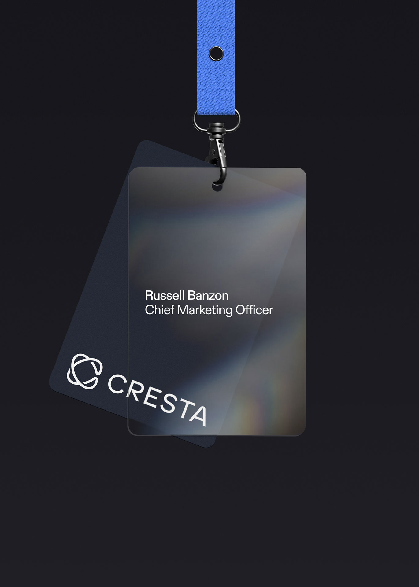
With the new identity system in place, Motto® translated Cresta’s brand into high-impact assets designed for clarity, consistency, and conversion. We focused on building practical tools that empower the internal team to activate the brand across marketing, product, and communications. From motion, presentations, and iconography to performance-driven landing pages, designed in collaboration with our web partner Antinomy, every deliverable was crafted to express Cresta’s intelligence and adaptability across every interaction.
(WHAT WE DID)
- Website Design
- Pitch Deck
- Motion Pack
- Brand Guidelines
Press Release
Read the full story“Cresta is proud of what this brand represents: not just the company we’ve been, but the company we’re building. Thank you to our fabulous partner Motto who worked with us on our visual identity from soup to nuts.”
(01)
Motto Method®
/ Overview
/ Overview
Wave of change: Introducing Cresta’s new brand.
Founded in Stanford’s AI lab, Cresta emerged from stealth in 2020 with a mission to help the world’s leading enterprises turn customer conversations into competitive advantage. As the company entered a new era through launching AI Agents, expanding globally, and securing $125M in Series D funding, it was clear the brand needed to evolve. Motto® was brought in to craft a visual identity worthy of Cresta’s technology, momentum, and ambition to lead the enterprise AI contact center category.
(Details)
- Engagement Flagship®
- Type Rebrand
- Category AI
- Model B2B
(02)
Motto Method®
/ Challenge
/ Challenge
A world-class platform hiding behind a second-tier brand.
Cresta had the momentum, the market traction, and the technology, but its visual identity told a quieter story. The brand system felt underpowered, lacking the clarity, confidence, and adaptability needed to lead in a crowded and rapidly evolving category. As Cresta scaled into new markets and launched more advanced AI capabilities, it needed more than a refresh. It needed a brand that looked as intelligent and transformative as the platform itself.

(03)
Motto Method®
/ Immersion
/ Immersion
Turning leadership vision into brand direction.
The name Cresta comes from the crest of a wave, the moment where momentum and transformation meet. That metaphor became more than a naming story, it became a strategic foundation. Through a series of immersive workshops and conversations with Cresta’s leadership team, we explored the company’s vision, culture, and category-defining ambition. Together, we aligned on the core themes of transformation, adaptability, and flow, and set out to design a system that visually expressed the vision.
(WHAT WE DID)
- Strategy Workshop
- Brand Audit
- Landscape Analysis

(04)
Motto Method®
/ Symbol
/ Symbol
Where intelligence meets elegance.
The new Cresta identity is inspired by the beauty and mathematics of Lissajous curves, a nod to the intricate, harmonic patterns that visualize the interplay of signals and conversations. These figures mirror the rhythm of human dialogue and AI interaction, which are central to Cresta’s product philosophy. We incorporated this energy into every detail, from the stylized “C” to the flowing peak of the “A,” creating a wordmark that feels modern and fluid. For the first time, Cresta now has a standalone symbol that is confident, adaptive, and instantly recognizable. It represents a wave of intelligent transformation.
(WHAT WE DID)
- Creative Strategy
- Logo & Symbol
- Art Direction
- Iconography
(05)
Motto Method®
/ Color & Type
/ Color & Type
Typography and color that scale with purpose.
Cresta’s visual system strikes a balance between clarity and intelligence through its evolved color palette and modern typography. The expanded accent colors add energy and functionality, especially in UI, data visualizations, and product applications where clarity and contrast are key. These hues extend beyond aesthetics, supporting a system built for performance and scale. The typographic system is anchored by Diatype by Dinamo. Its simplicity is elevated through a structured use of grayscale, which offers depth and hierarchy to type layouts. Together, the color and type choices create a brand expression that is confident, adaptable, and distinctly Cresta.
(WHAT WE DID)
- Color System
- Type System
- Accent System for UI/Product Applications
- Accessibility and Contrast Testing
Testimonial
Work with us“Motto® honored where we’ve been, while bringing to life the vision we have for the future. They created an unbelievable experience.”
(06)
Motto Method®
/ Applications
/ Applications
Bringing the brand to life across key touchpoints.
With the new identity system in place, Motto® translated Cresta’s brand into high-impact assets designed for clarity, consistency, and conversion. We focused on building practical tools that empower the internal team to activate the brand across marketing, product, and communications. From motion, presentations, and iconography to performance-driven landing pages, designed in collaboration with our web partner Antinomy, every deliverable was crafted to express Cresta’s intelligence and adaptability across every interaction.
(WHAT WE DID)
- Website Design
- Pitch Deck
- Motion Pack
- Brand Guidelines
Press Release
Read the full story“Cresta is proud of what this brand represents: not just the company we’ve been, but the company we’re building. Thank you to our fabulous partner Motto who worked with us on our visual identity from soup to nuts.”
(01)
Motto Method®
/ Overview
/ Overview
Wave of change: Introducing Cresta’s new brand.
Founded in Stanford’s AI lab, Cresta emerged from stealth in 2020 with a mission to help the world’s leading enterprises turn customer conversations into competitive advantage. As the company entered a new era through launching AI Agents, expanding globally, and securing $125M in Series D funding, it was clear the brand needed to evolve. Motto® was brought in to craft a visual identity worthy of Cresta’s technology, momentum, and ambition to lead the enterprise AI contact center category.
(Details)
- Engagement Flagship®
- Type Rebrand
- Category AI
- Model B2B
(02)
Motto Method®
/ Challenge
/ Challenge
A world-class platform hiding behind a second-tier brand.
Cresta had the momentum, the market traction, and the technology, but its visual identity told a quieter story. The brand system felt underpowered, lacking the clarity, confidence, and adaptability needed to lead in a crowded and rapidly evolving category. As Cresta scaled into new markets and launched more advanced AI capabilities, it needed more than a refresh. It needed a brand that looked as intelligent and transformative as the platform itself.
(03)
Motto Method®
/ Immersion
/ Immersion
Turning leadership vision into brand direction.
The name Cresta comes from the crest of a wave, the moment where momentum and transformation meet. That metaphor became more than a naming story, it became a strategic foundation. Through a series of immersive workshops and conversations with Cresta’s leadership team, we explored the company’s vision, culture, and category-defining ambition. Together, we aligned on the core themes of transformation, adaptability, and flow, and set out to design a system that visually expressed the vision.
(WHAT WE DID)
- Strategy Workshop
- Brand Audit
- Landscape Analysis
(04)
Motto Method®
/ Symbol
/ Symbol
Where intelligence meets elegance.
The new Cresta identity is inspired by the beauty and mathematics of Lissajous curves, a nod to the intricate, harmonic patterns that visualize the interplay of signals and conversations. These figures mirror the rhythm of human dialogue and AI interaction, which are central to Cresta’s product philosophy. We incorporated this energy into every detail, from the stylized “C” to the flowing peak of the “A,” creating a wordmark that feels modern and fluid. For the first time, Cresta now has a standalone symbol that is confident, adaptive, and instantly recognizable. It represents a wave of intelligent transformation.
(WHAT WE DID)
- Creative Strategy
- Logo & Symbol
- Art Direction
- Iconography
(05)
Motto Method®
/ Color & Type
/ Color & Type
Typography and color that scale with purpose.
Cresta’s visual system strikes a balance between clarity and intelligence through its evolved color palette and modern typography. The expanded accent colors add energy and functionality, especially in UI, data visualizations, and product applications where clarity and contrast are key. These hues extend beyond aesthetics, supporting a system built for performance and scale. The typographic system is anchored by Diatype by Dinamo. Its simplicity is elevated through a structured use of grayscale, which offers depth and hierarchy to type layouts. Together, the color and type choices create a brand expression that is confident, adaptable, and distinctly Cresta.
(WHAT WE DID)
- Color System
- Type System
- Accent System for UI/Product Applications
- Accessibility and Contrast Testing
Testimonial
Work with us“Motto® honored where we’ve been, while bringing to life the vision we have for the future. They created an unbelievable experience.”
(06)
Motto Method®
/ Applications
/ Applications
Bringing the brand to life across key touchpoints.
With the new identity system in place, Motto® translated Cresta’s brand into high-impact assets designed for clarity, consistency, and conversion. We focused on building practical tools that empower the internal team to activate the brand across marketing, product, and communications. From motion, presentations, and iconography to performance-driven landing pages, designed in collaboration with our web partner Antinomy, every deliverable was crafted to express Cresta’s intelligence and adaptability across every interaction.
(WHAT WE DID)
- Website Design
- Pitch Deck
- Motion Pack
- Brand Guidelines
Press Release
Read the full story“Cresta is proud of what this brand represents: not just the company we’ve been, but the company we’re building. Thank you to our fabulous partner Motto who worked with us on our visual identity from soup to nuts.”