
(Idea Worth Rallying Around®)
→
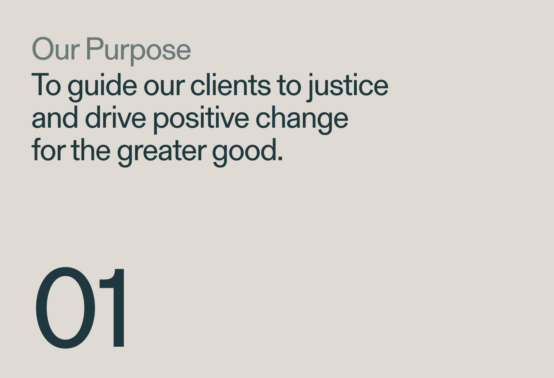
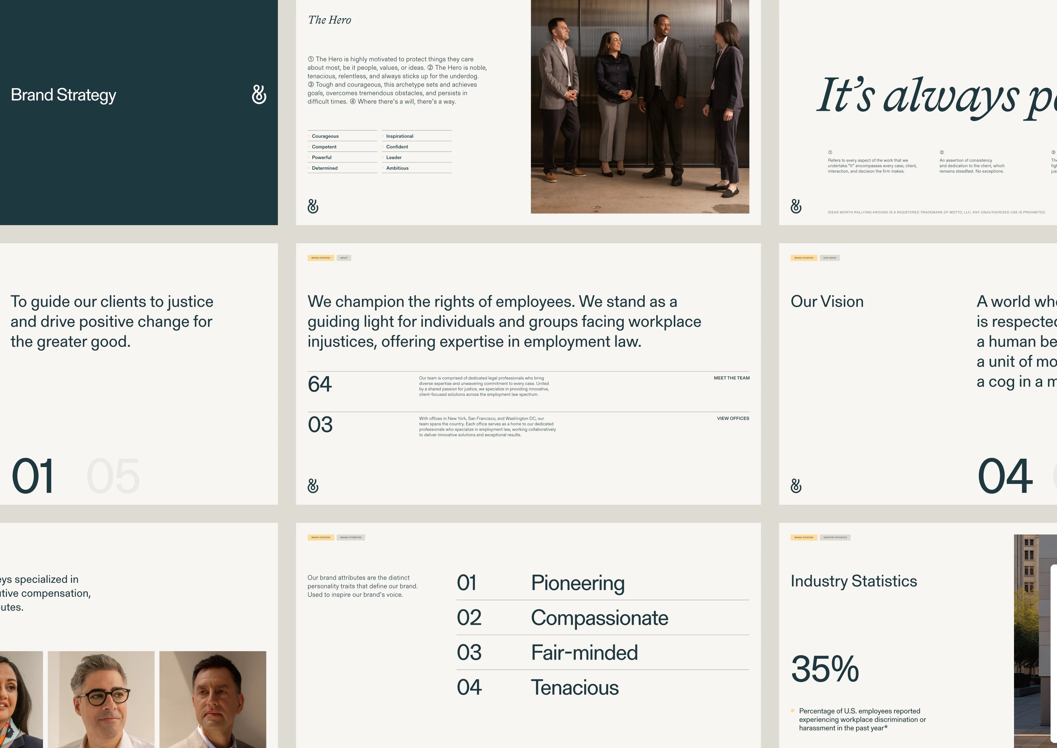
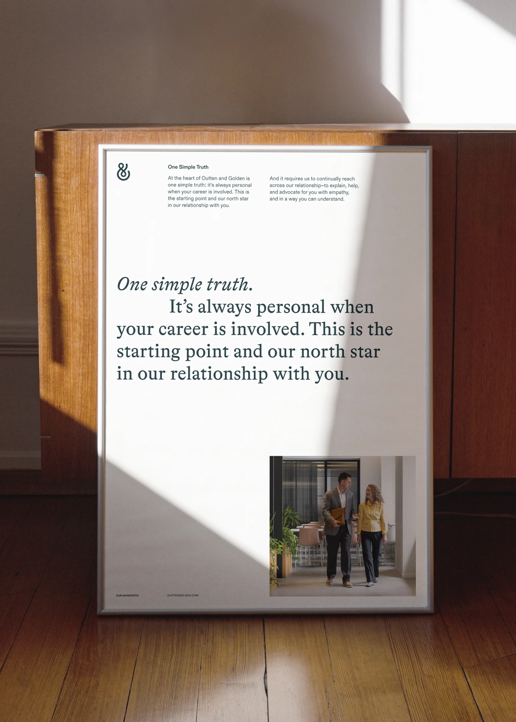
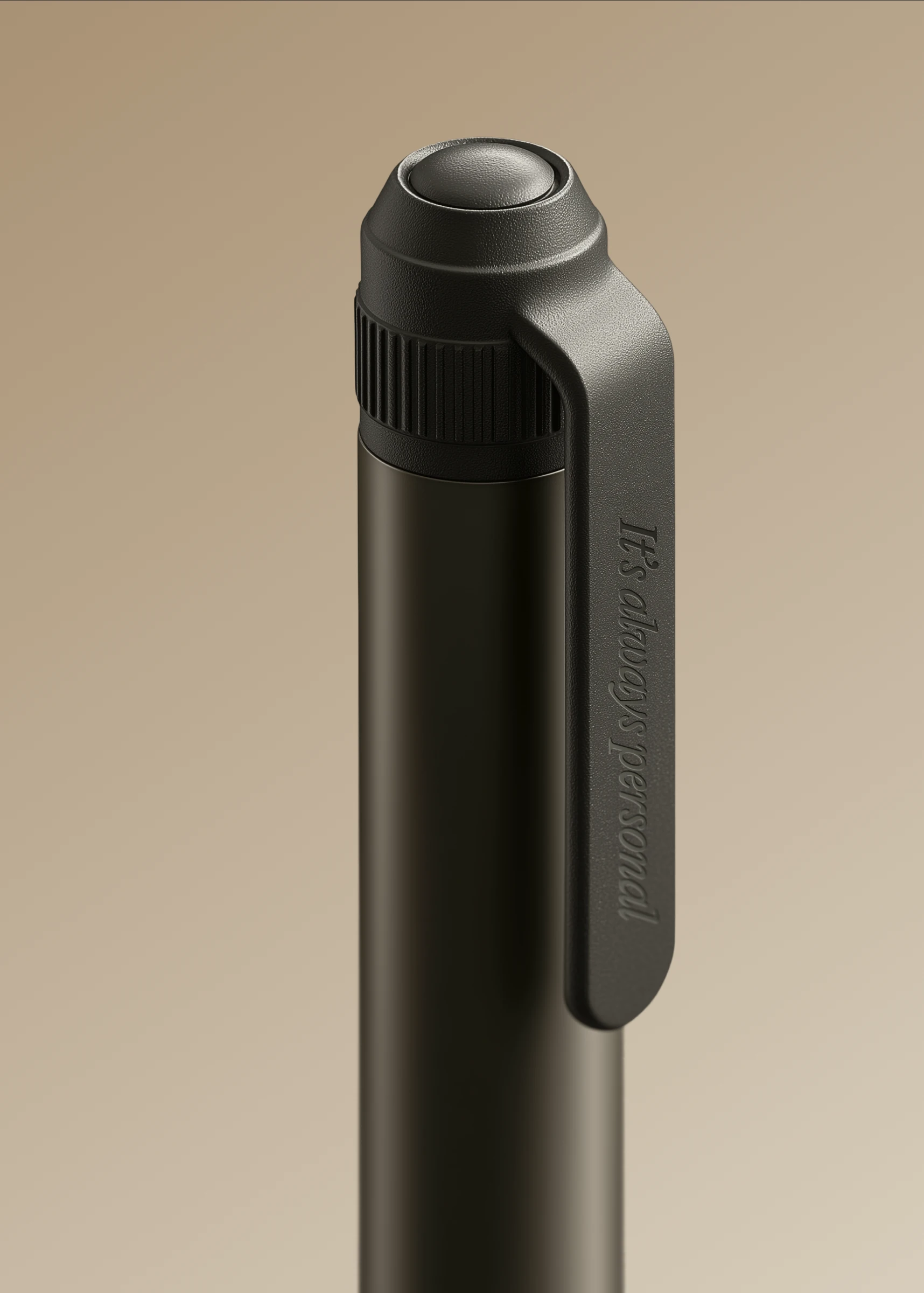
It's always personal
It's always personal
It's always personal
It's always personal
→
It's always personal
It's always personal
It's always personal
It's always personal