
Behind the Motto® rebrand
New Vision, New Motto®
From Sunny Bonnell and Ashleigh Hansberger
Motto’s story began in 2005 with $250 and a dream. Since then, we’ve grown from a two-person design shop into a globally recognized, top branding agency for innovation teams.
2020 and 2021 marked exciting new growth from all angles. We wrote a bestselling business book, Rare Breed, A Guide to Success for the Defiant, Dangerous, and Different (HarperCollins), expanded our team internationally, attracted iconic clients like Microsoft, Virgin, and Google, and became globally recognized, keynote speakers. We also launched a leadership program called VisionCamp®.
Toward the end of 2021, we embarked on a journey to rebrand Motto®. Our strong reputation has carried us far, but our bold vision for the future requires a fresh way of presenting ourselves.
Motto® Logotype
A Vision for the Future
To help carve our new path forward, we engaged a business consultant to conduct a holistic, objective, 360° assessment. We then followed the same process that Motto takes our clients through. We interviewed leadership, polled our team, evaluated our culture, and zoomed out to analyze everything we’ve built. This helped us understand what is working and where our gaps are. We then actioned specific recommendations to bring us to the next level.
This included:
- Performance benchmarking to position Motto® beyond other firms.
- Positioning adjustments so that Motto® is not interchangeable.
- Reducing our service offerings to more strategic, high-value work.
- Structuring roles, including us as founders.
There were several different paths we could have taken with our positioning. Still, we doubled down on Motto’s “zone of genius”: aligning leadership teams and shaping vision at the leadership level. Most importantly, we are best suited for fast-growing tech companies changing the future of how we live and work.

History of Our Name
Motto (noun): A short sentence or phrase chosen as encapsulating the beliefs or ideals guiding an individual, family, or institution.
Origin: Late 16th century.
Mottos originated with heraldry, starting in the ancient world but coming to fruition in the High Middle Ages. In this period, noble families were given a coat of arms, including various symbols such as colors, animals, and weapons to represent the family.
Somewhere on the coat of arms would be a motto, often in Latin or the ancestral language of the family. This motto would express the particular priorities and history of the family.
For thousands of years, mottos were literal battle cries used by leaders to unite their people and build their empires. Today’s economy might be less cut-throat, but the right words still stir people into action to achieve incredible feats.
Brand mottos are today’s commercial war cries. They make company purpose palpable and galvanize people around a common goal. Innovation might race forward, but the power of mottos is timeless and far-reaching. We call ourselves Motto® and choose a flag as our crest.
Motto® Tagline
Motto® Idea Worth Rallying Around™
Idea Worth Rallying Around®
Motto® has become synonymous with our tagline, Ideas Worth Rallying Around®, which we introduced in 2019. We believe every brand has a single signature idea at the center of the business that is powerful enough to rally everyone from customers to employees to investors. Ideas Worth Rallying Around® reminds people what’s important. This is a large part of our work—turning companies and brands into Ideas Worth Rallying Around®.
What is our big idea? It turns out we hadn’t succinctly defined it. After months of deep work, it was sitting in plain sight: Do Big Things. It is now codified in our culture and drives everything we do for ourselves, our company, and our clients.
We have united our purpose, vision, and big idea. Our brand system is intelligent, meaningful, and diverse. Most importantly, it reinforces our differentiation.
Motto® Voice Pillars
The Motto® Voice
Refreshingly honest and direct, our brand voice attracts those who want to go bigger, go further and leave nothing on the table.
Daring: The business world is full of clichés, tired thinking, and fear of ruffling feathers. Our work and ideas make people sit up. We’re the wake-up call, and we don’t hold back.
Inspiring: Being daring wakes people up, but it’s also our job to show them what’s possible. We believe in lifting people to get the best possible view of their future.
Motivating: Our most significant value to clients is that we know what they should do and how to go about it. So every bold statement and pep talk is underpinned by deep expertise and practical guidance.

Motto® Brand System
Brutalism’s etymology comes from the French meaning “of concrete” or “béton brut,” meaning raw concrete. It is often characterized by its simple, plain, and unadorned style. Brutalism as a design aesthetic spoke to us, and we built our design language around it.
- Evolves into something bold and attitudinal and disguises nothing at all.
- Follows the philosophy of honesty in form. It speaks to our alignment of brand and culture.
- Leaves a strong impression on the observer and communicates directly with them.
- Characterized by its natural appearance and experimentality.
- Nonconforming in style and rebels against the established trends.
Motto® Flag

“An unspoken rule is that when "terra nillius" (no man's land) is found, one claims the land by planting their flag in the soil. ”

Flag and Logotype
To support our Ideas Worth Rallying Around™ tagline, we introduced Motto’s black flag brandmark in 2019 to symbolize our boldness and ambition. Prior brandmarks between 2005-2018 all focused on an M letterform, which never felt purposeful, meaningful, unique, or bold enough for our company’s symbol. Flag planting means “claiming ownership” of something. An unspoken rule is that when “terra nillius” (no man’s land) is found, one claims the land by planting their flag in the soil.
Mottos, big ideas, rallying, planting flags. It’s all just so…Motto®.
We designed the original flag mid-2015, and our Creative Director refined it in 2021 to improve spacing. The Motto logotype has custom ink traps and is subtle and purposeful.


Color Palettes
We explored color for almost a year! We’ve been mainly color-phobic with our visual identity. Black and white have underpinned Motto’s signature look since 2005. We realized that our infamous monochromatic palette complemented our Brutalist style. Our secondary palette offers little hints of color and is used to code different content categories.


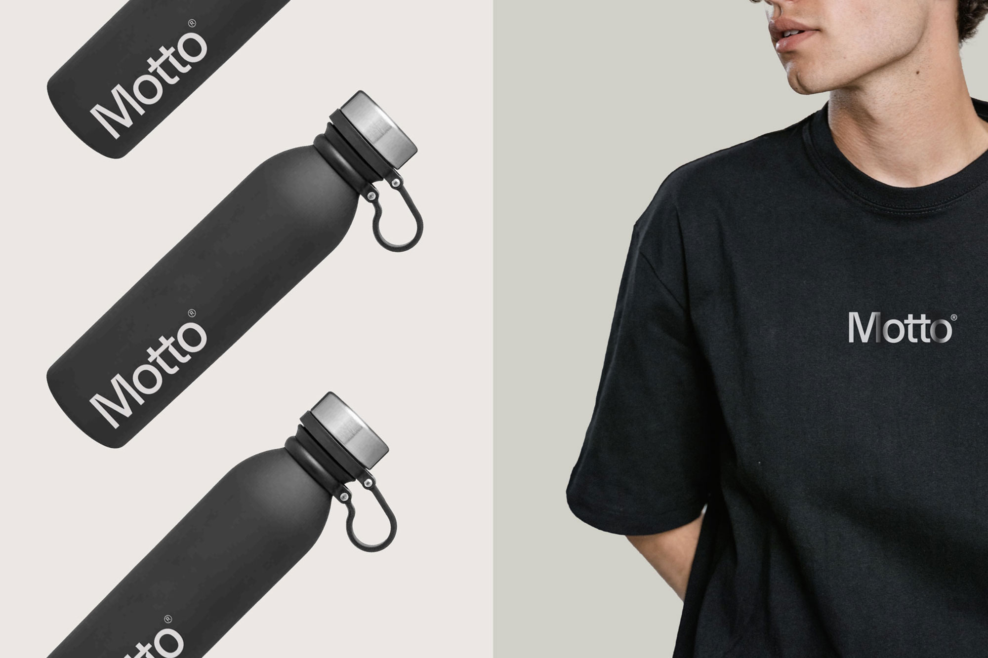
Branded Swag
Our new visual identity extends into incredible branded apparel, graphic shirts, and swag items. We created a flexible brand system from team and client swag kits to merch like mugs, five-panel hats, and sweatshirts.

Social
Our refreshed content strategy and design tapped from our new vision to champion others to do big things, inspire ideas, and share our expertise.

Website
Our old website evolved over many years and began to show its age. The vision for the new website was bold. We restructured the website to fit our new brand architecture and highlighted our work, workshops, speaking, and books. We incorporated motion on every page with micro-interactions to elevate the experience and make it feel architectural. We reversed the Motto® signature black website to cool grey/white. It opened up the brand and felt more approachable. We paired that with clean type, graphic imagery, video, and creative interactions.


By Sunny Bonnell
Co-Founder & CEO Motto®
